Introduction
In this dossier, we will present the role of colors in artworks, introduce the concept of color theory and the role of colors in creating a sense of depth and perspective. To do so, in the thematic section of this dosser, we will first look at the origins of colors, then we will provide comprehensive information regarding color theory, introducing concepts such as hue, value, chroma, contrast, and more. Lastly, we will present the different methods in which colors can be used to create depth.
Then, in the second section of this dossier, we will provide a series of examples of artworks using these techniques, as well as two detailed activities to introduce your learners to the different concepts of this dossier.
The objectives of this dossier are to:
- discover how our eyes see colors,
- define what color theory is,
- learn specific techniques and terms related to colors,
- understand how the aforementioned points have shaped painting through history,
- discover the meaning of colors in certain situation,
- understand how color is used to create depth,
- practice how to use color to create a sense of depth.
The theme
The nature of the theme
What is color? What is depth? These are questions that may have an easy answer, but that become incredibly powerful in the field of art.
Theoretically, color is defined as “the aspect of things that is caused by differing qualities of light being reflected or emitted by them. To see color, you have to have light. When light shines on an object some colors bounce off the object and others are absorbed by it.” But color is more than light and its reflection, it is an artist’s main tool to express themselves, share their beliefs or convey messages. Artists utilize their knowledge of color to portray mood, light, depth, and point of view in a work of art.
Colors have 3 main properties:
- Hue: Hue refers to the color itself. It is distinct from any other color and represents the name we assign that color such as blue, yellow, and indigo.
- Value: Value (or lightness) is the darkness or lightness of a hue. When hues are mixed with white, the resulting color will have a lighter value called tints. When hues are mixed with the color black, they have a darker value called shades. The many values of a hue can be shown on a gradient spectrum resembling paint samples.
- Chroma or saturation: A color’s chroma refers to the purity of a color. Chroma is related to saturation, with high-chroma colors appearing brighter, and low-chroma colors appearing duller.
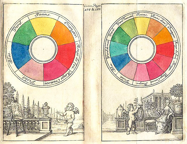
Color theory
To fully master the use of colors, an artist must understand the basics of Color Theory; a set of guidelines for mixing, combining, and manipulating the color spectrum.
Color theory dates back to Antiquity and has evolved over time. From Aristotle’s teaching on how mixing colors can create others, to Isaac Newton’s theory of colors and the role of primary colors, there has been significant research and debate about the subject.
The color theory that is most widely used today lies on the fundamental rule that three colors cannot be made by mixing other colors. These three colors are red, blue and yellow, and are considered the primary colors. When mixed, these three primary colors can form many other colors.
Secondary colors are the result of mixing two primary colors. In the traditional color model, the three secondary colors are green (yellow plus blue), orange (yellow plus red), and purple (red plus blue).
Then, tertiary colors are the combination of one primary color with one secondary color. There are six tertiary colors on the traditional color wheel: magenta (red-purple), vermillion (red-orange), amber (yellow-orange), chartreuse (yellow-green), teal (blue-green), and violet (blue-purple).

Creating contrast with colors
While colors set different tones and can create different contrast there are some theories that help create a more harmonious painting.

Complementary colors are colors that sit opposite of each other on a color wheel. Complementary color schemes include blue with orange, red with green, and yellow with purple. Complementary colors will contrast greatly.
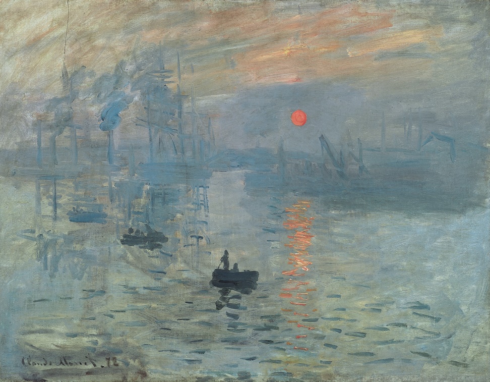
For example, in Impression, Sunrise by Claude Monet (1872), a small orange sun and some orange light reflected on the clouds and water in the center of a hazy blue landscape. This painting, with its striking use of the complementary colors orange and blue is a perfect example of complementarity.
Blue and orange were a very popular combination of colors for impressionists. They studied color theory and knew that orange placed next to blue made both colors much brighter. Auguste Renoir painted boats with stripes of chrome orange paint straight from the tube. Paul Cézanne used orange made of touches of yellow, red and ochre against a blue background.
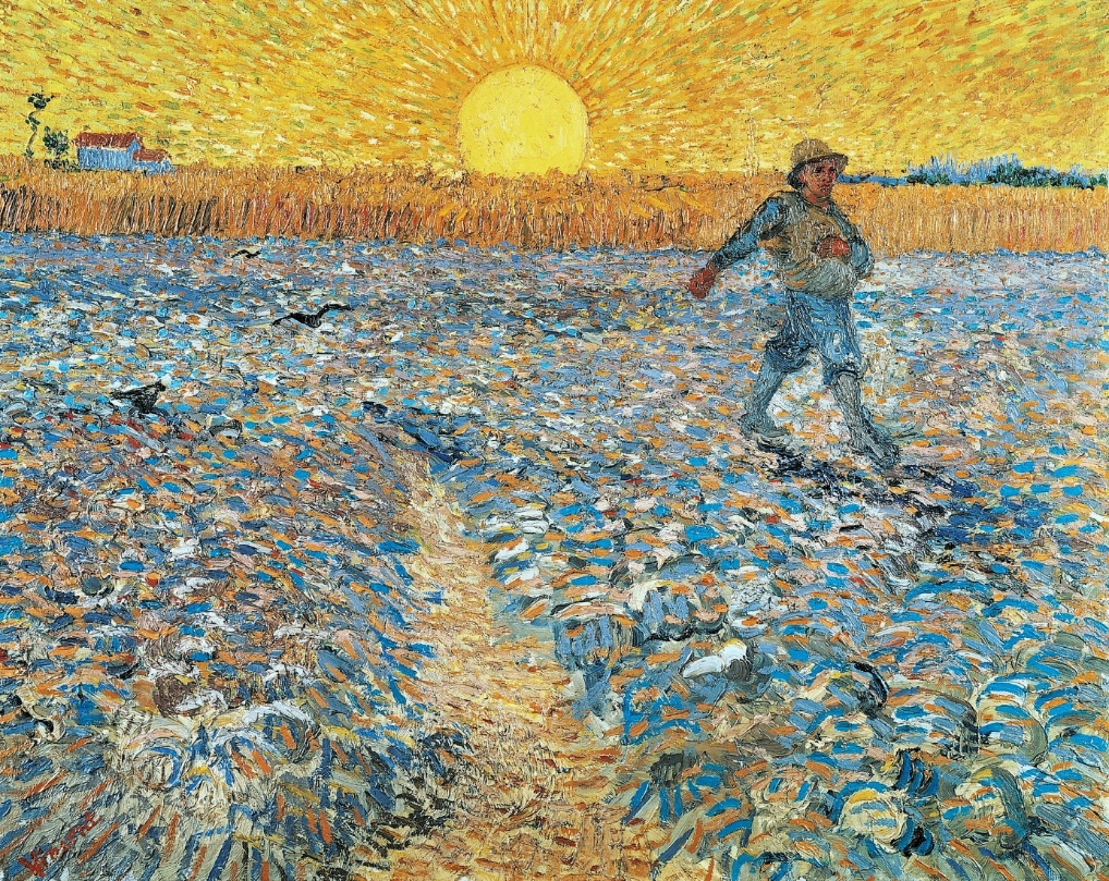
Vincent van Gogh especially appreciated this technique; he even created his own oranges with mixtures of yellow, ochre and red. Below is The Sower, 1888 by Vincent Van Gogh.
While complementary colors sit on the opposite of the color spectrum, analogous colors sit next to each other on the color wheel. They include yellow paired with chartreuse and green; red with vermillion and orange; and blue with teal and violet. The three colors in each pairing share a common hue, so they appear to match.
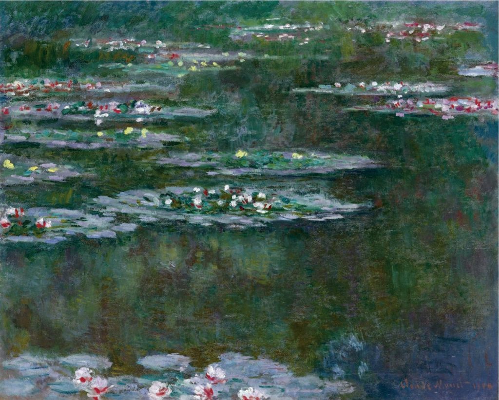
In the painting below, Lily Pond (1904) by Claude Monet, you can see the use of analogous colors and the use of green, light greens, light blues and touches of purple and more.
Temperature of colors:
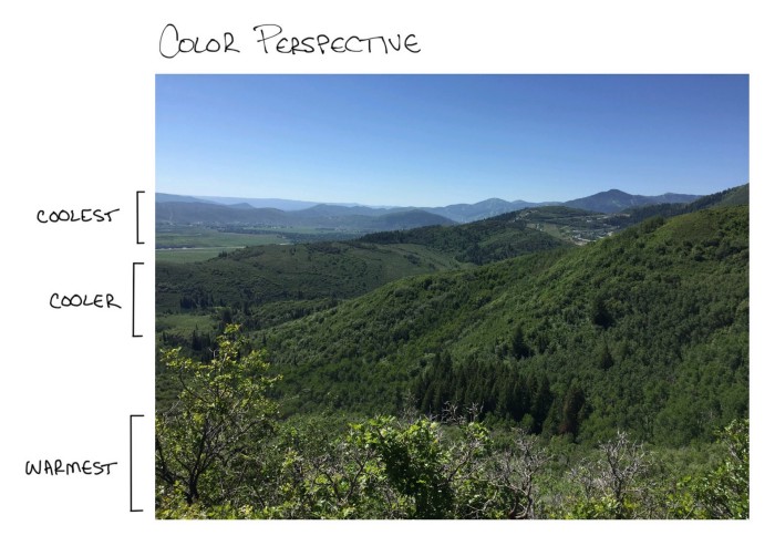
To understand how depth can be created by colors, it is important to understand the different temperatures that colors can take. Temperature refers to the warmth that a color contains. These colors are usually identified as warm or cool colors.
Artists usually split the color wheel in two down the middle. So, reds, oranges and yellows are generally considered to be warm colors, and blues and greens are generally considered to be cool colors.
Using paintings, here are examples of warm and cooler tones.
Warm colors: Red, yellow, orange, and similar tones.
Cool colors: Blue, green, purple, and similar tones.
Color and Depth:
There are many methods that artists can use to create depth in painting. Depending on the artist’s period, style, and techniques, creating a sense of depth and perspective can greatly vary from one painting to another.
So, what is depth?
In art, depth refers to the perceived distance between the background and the foreground of a composition. It can be compared to creating the illusion of three-dimensional space on a two-dimensional canvas. There is a wide range of tools such as perspective, lines, colors and shading that can create the illusion of space and add a layer of reality.
Therefore, how do artists create the feeling of depth and perspective by using colors? The theory lies with the idea that warm colors appear closer to the viewer while cool colors appear farther. The opposite is also true against a white background.
This is because the wavelengths of warm colors are longer, so your eyes see them sooner than the shorter wavelengths of cooler colors.
This technique is also called atmospheric perspective or aerial perspective. This process uses modification of value (tone) to create the sense of depth. In other words:
- As objects move further away from the viewer: values become less contrasty, colors get weaker and cooler, and details become less distinct.
- As objects come forward and closer to the viewer: values have more contrast, colors get stronger and warmer, and details become sharper.
To create this type of perspective, colors must be modified by chromatic intensities, edge descriptions, brushwork types and details, and the size of color touches in the image.
Chromatic intensity
Degrees of chromatic intensity (or brightness of a color) can seem to cause areas to visually come forward or recede relative to other color areas. Colors that are greyer will optically recede next to colors that are less grey. Cooler colors tend to recede next to ones that are warmer. Color mixtures that have more white pigment in them will seem to recede next to colors that are purer and so have less white pigment in them. In the painting below, Lake George Reflection, 1921 by Georgia O’Keeffe, you can see that the brighter colors appear strong and luminous, while the paler tones recede and create a sense of depth as the colors get lighter and lighter in the horizon.
This artwork is a Property from the Collection of J.E. Safra, therefore it cannot be used in this dossier.
Edge relationships
The edges of a color stroke or color object will come forward more effectively if the edges are sharper and clearer than those around them.
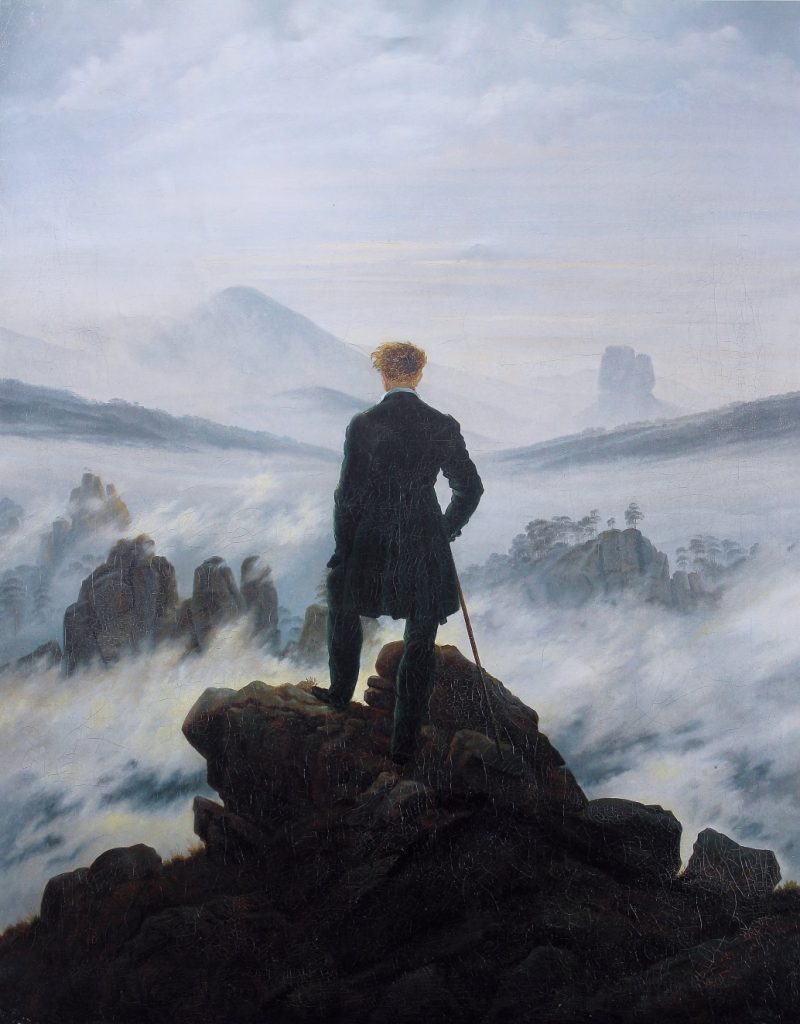
A general concept is that: sharper, clearer, more definite strokes, colors or marks come forward while softer less defined strokes with softer edges recede by comparison. If one combines that with color, one can say that colors that have sharper edges and clearer strokes come forward compared to those that have softer edges and less clear strokes. In the painting below, Wanderer above the sea of fog, 1818 by Caspar David Friedrich, the dark and solid rock comes forth with stronger intensity than the elusive and soft greys and blues in the background. The edge relationship between the foreground and background creates a strong sense of depth.
Scale and Shape:
Larger strokes of color generally come forward visually compared to smaller ones. Areas of color that have clearer, bolder shapes and size will bring the foreground closer to the viewer while smaller, softer ones will seem to recede into the distance. These concepts are especially valuable where the artist wants a strong and clearly defined foreground, middle ground, and background.
Historical context – a brief history of colors
Colors were first mixed by using very natural pigments – a combination of soil, animal fat, burnt charcoal, and chalk – as early as 40,000 years ago, creating a basic palette of five colors: red, yellow, brown, black, and white. Since then, from the Renaissance to Impressionism, colors have evolved through exploration or scientific discoveries and created new and never-before-seen colors.
Red is one of the oldest colors. Found in iron-rich soil, red ochre is one of the oldest pigments that was used in prehistoric caves. Later on, during the 16th and 17th century, an insect (the cochineal) was used to create a red dye.
Blue was one of the most expensive colors, as the gemstone it came from could only be found in a single mountain range in Afghanistan. Considered a precious material, the price of this gemstone (Lapis lazuli) was similar to that of gold. It was only in the 1950s that a synthetic version of ultramarine blue was created, and the color became more democratic in its use.
Yellow was not a very popular color in classical painting. Artists such as J.M.W. Turner and Vincent van Gogh were some of the few artists to embrace the color. J.M.W. Turner was often criticized for his use of yellow, saying that his paintings ‘were afflicted with jaundice’.
Green pigments, while used to evoke nature and spring, were some of the most poisonous in history. Laced with arsenic, Sheele’s Green, a bright green, became instantly popular in the Victorian era, despite its dangerousness. Later, Paris Green, a more durable alternative using rodenticide and insecticide was used by Claude Monet, Paul Cezanne and Pierre-Auguste Renoir. The color was still highly toxic and may have been responsible for Cezanne’s diabetes and Monet’s blindness.
Purple was especially popular for Impressionists such as Claude Monet. He once stated: “I have finally discovered the true color of the atmosphere. It’s violet. Fresh air is violet”.
Social and cultural context – the meaning of colors
Color symbolism in art refers to the use of color as a symbol in various cultures. There is great diversity in the use of colors and their associations between cultures and even within the same culture in different time periods.
Red is often associated with love and passion. It can also be associated with danger and warning (think of labels, stop signs, red lights, etc.). Red can have a physical effect on people, raising blood pressure and respiration rates.
Orange is a very vibrant and energetic color. In its muted forms, it can be associated with the earth and with autumn. Because of its association with the changing seasons, orange can represent change and movement in general. Orange is also strongly associated with creativity.
Yellow is often considered the brightest and most energizing of the warm colors. It’s associated with happiness and sunshine. In France, yellow can also be associated with deceit and cowardice.
Green is a very down-to-earth color. It can represent new beginnings and growth. It also signifies renewal and abundance. Alternatively, green can also represent envy or jealousy, and a lack of experience.
Blue is often associated with sadness in English culture. Blue is also used extensively to represent calmness and responsibility. Light blues can be refreshing and friendly. Dark blues are stronger and more reliable. Blue is also associated with peace and has spiritual and religious connotations in many cultures and traditions.
Purple is a combination of red and blue and takes on some attributes of both. It’s associated with creativity and imagination, too. The dyes used for creating purple hues were extracted from snails and were very expensive, so only royals and the very wealthy could afford them.
Pedagogical approach
Understanding color and depth is important to understand art altogether. With colors, artists are able to convey meaning, to send messages to their audience and create feelings and emotions. By using colors to create depth, they are able to bring two-dimensional imagery to life, and guide the learner’s eye to see details, to understand perspective and to feel more.
Why is this theme relevant to adult learners?
This theme is especially relevant for adult learners as color theory is a complex and well-designed process that can be analyzed through most paintings. In every museum, exhibition or art center, artists have used some sort of color scheme to create depth.
What are the learning outcomes of embedding this art theme with an educational activity?
Colors play a crucial role in creating an atmosphere, expressing a feeling, showing an expression and more. Colors are the best tools that painters have to convey their message. Therefore, understanding the theories and techniques behind the use of these colors is important to understand a painting altogether.
How to do it: strategies, tools, and techniques.
Learners can approach color theory and depth through different tools, whether it is through analysis of famous paintings, or by working with a color palette themselves.
Artworks
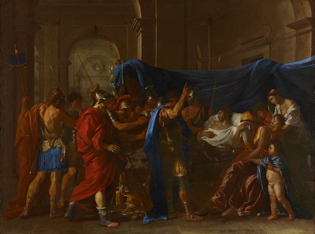
Artwork #1 The Death of Germanicus, Nicolas Poussin, 1627.
- Its position-relation to the theme: This painting uses the main primary colors of the color wheel. Notice the strong blues, red and yellow that stand out compared to the paler and darker skin tones and whites.
- Short description: The painting represents the Young Roman general Germanicus on his death bed, after being poisoned by the emperor Tiberius. The scene shows Germanicus asking his friends to avenge him while his wife mourns. It is a representation of heroism and dignity.
- Location and European dimension: The painting is located in the Minneapolis Institute of Art, Minneapolis, MN, US. It is Nicolas Poussin’s first major history painting of a death scene. The composition, with figures crowded together near the front, is based on Roman sarcophagus reliefs. Poussin spent a lot of time in Rome where he developed a classical style that strongly influenced both Italian and French art later.
- Possible educational exploitation: The Death of Germanicus is quite an old painting; it dates to 1627. It can be interesting then to see if colors, especially the blues had some special meaning in the representation of the painting. Do different colors represent different armies? You can introduce the meaning of blue to the learners to understand more of the power structure in the painting.
Artwork #2 The Green Stripe, Henri Matisse, 1905
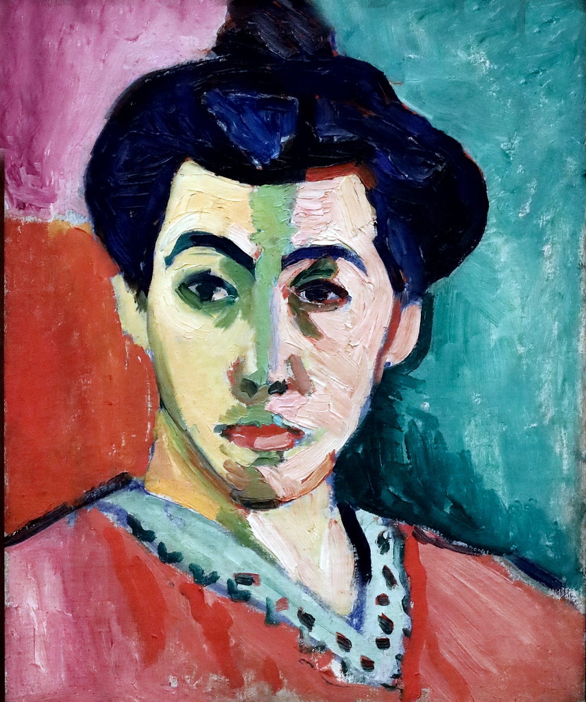
- Its position-relation to the theme: This painting shows the use of the complementary colors (red and green) on the color wheel.
- Short description: The painting is a portrait of Matisse’s wife, Amélie Noellie Matisse-Parayre. It is an oil painting on canvas, and it was named the Green Stripe for the line that divides her face in two. Matisse meant to create a sense of light, shadow and volume without using traditional shading.
- Location and European dimension: Henri Matisse’s painting was shocking at the time, as it broke conventions. Works such as his marked the beginning of a movement called “Les Fauves” (the wild beasts). Fauvism emphasized on strong colors over realistic values. The painting is located in Copenhagen, at the Statens Museum for Kunst.
- Possible educational exploitation: Colors were of prime importance for the Fauves. Explore with your learners how they used colors to separate themselves of the more traditional styles of their forebearers the Impressionists.
Artwork #3 Impression Sunrise, by Claude Monet, 1872
- Its position-relation to the theme: Monet’s painting uses the complementary colors blue and orange to show his landscape. It also uses interesting techniques of soft edging and aerial perspective to create depth.
- Short description: Impression, Sunrise, was created from a scene in the port of Le Havre. Monet depicts a mist, which provides a hazy background to the piece set in the French harbor . The orange and yellow hues contrast well with the dark boats, where little, if any detail is visible to the audience.
- Location and European dimension: The painting Impression Sunrise was first shown at a show that would become the “Exhibition of the Impressionists”. Originally, the term impressionist was used depreciatively, but Monet and his fellow artists adopted the term as their movement flag name. The painting is now located in the Musée Marmottan Monet in Paris.
- Possible educational exploitation: The painting above is quite an historically important painting. It is considered the first representation of an ‘Impressionists’ painting style; the name of the movement was based on it. You can explore with your learners how the painting was received, and how it inspired artists to adopt similar painting techniques.
Artwork #4 Woman with Yellow Hair (Femme aux cheveux jaunes), Pablo Picasso, 1931
This artwork is under a copyright, owned by ©The Estate of Pablo Picasso / Artists Rights Society (ARS), New York, and therefore cannot be used in this dossier. The original artwork can be seen in the Guggenheim Museum in New York, USA.
- Its position-relation to the theme: This painting is a representation of complementary colors purple and yellow as well as green and red.
- Short description: This painting by Picasso represents a portrait of his secret lover Marie-Thérèse Walter. She was blonde, and the muse of Picasso for many years.
- Location and European dimension: Picasso’s style changed in the 1925-30, from the end of Cubism, Picasso’s art evolved into a more sensual, biomorphic style which was celebrated in the painting of his mistress. He wanted to represent his voluptuous body and tresses with this painting. The way he shaped her face also became a signature of his later artworks, appearing in sculpture, prints and more.
The painting is now displayed in the Solomon R. Guggenheim Museum, New York City, US
- Possible educational exploitation: Picasso’s previous phase was the well-known cubism phase. You can discover with your learners the stark differences between the straight, almost stern colors and shape that he previously used in comparison with the bodily, soft, and rounded shape that the painting above inspires.
Artwork #5 The Olive Trees, Vincent Van Gogh, 1889
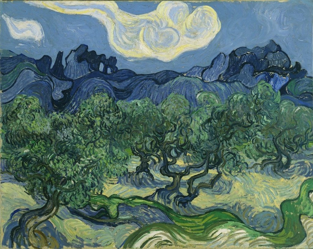
- Its position-relation to the theme: This painting uses the technique of analogous colors (blues, greens, etc.), sitting next to each other on the color wheel.
- Short description: The painting represents fields of olive trees in the region of Saint-Remy in the South of France. For Van Gogh, they have a special meaning, as they represent life, the divine and the cycle of life.
- Location and European dimension: Prior to the series of Olive trees, the work of Van Gogh was duller and darker. After meeting artists such as Degas and Seurat, who were fine technicians of colors, Van Gogh himself started to overwhelm his painting with colors, to the point of calling it sometimes “Expressionism”.
The painting is now displayed in the Museum of Modern Art, New York, USA
- Possible educational exploitation: There are at least 15 paintings of Olive Trees done by Van Gogh at this period. Explore some of the most famous ones, discover how his stay in a French asylum shaped his style and learn his unique techniques.
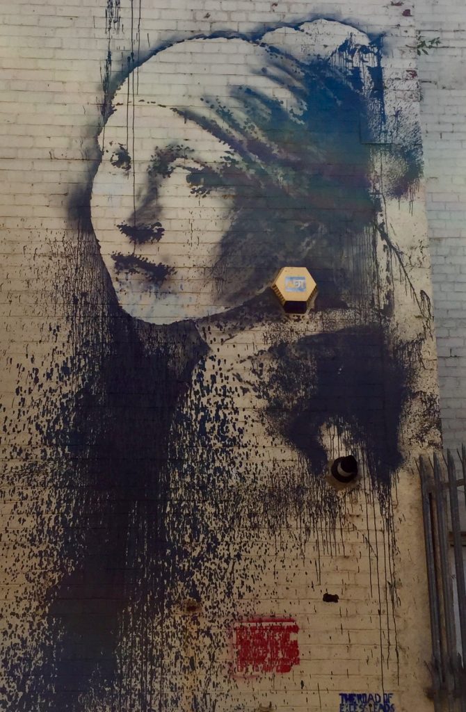
Artwork #6 The Girl with the Pearl Earring, Johannes Vermeer, 1665
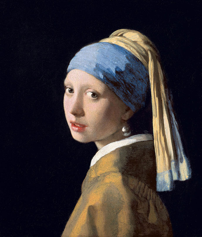
- Its position-relation to the theme: The Girl with the Pearl Earring is a masterpiece of color, depth, and intimacy. With the use of a dark background, the subject stands out clearly, while his use of lighter colors for her face contrasts with the darker tone of the rest of the subject. Red, a warm color is used only on her lips, which further draws the attention to her face and mysterious look.
- Short description: Vermeer’s painting is a tronie (a character study and not a strict portrait) of a young girl. We do not know who the girl is, but he has given her an ‘exotic’ look with the use of a headscarf, a fashion item not often used in the Netherlands at the time.
- Location and European dimension: The artwork has been extensively studied over the years. In 1994, it was discovered that the background was originally a dark glazed green and not black. In 2018, while many assumed that the girl was a fiction of imagination, the study showed that he was painting a real person. The Girl with the pearl earring has also impacted many cultural representations from films to street art.
The artwork is displayed in the Mauritshuis, The Hague, Netherlands.
- Possible educational exploitation: Vermeer had a unique style as he did not produce large quantity of painting. You can compare this tronies to his more lifestyle and genre painting, to understand his full panel of art.
Artwork #7 The Decline of the Carthaginian Empire, J.M.W Turner, 1817
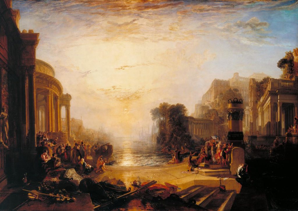
- Its position-relation to the theme: The usage of warm colors to create the impression of setting sun is very delicate. Furthermore, the use of cooler colors declining in Hue from the corners to the exteriors help to create this feeling. The city is in shades of orange, which are complementary with blue. The technique of using darker color in the foreground, and brighter ones in the background also reinforce the feeling of depth.
- Short description: This painting represents the decline of the North African Empire, Carthage, which was the most powerful empire before the rise of ancient Rome. The decline is symbolized by the setting sun, which Turner saw as inevitable.
- Location and European dimension: J.M.W. Turner was, probably, one of the most prolific British painters of his time. His use of colors, light and atmosphere is well known. For this artwork, Turner used techniques from the ‘Old Masters’, especially from one, Claude Lorrain. He loved Claude Lorrain’s work so much, he asked the painting to be hung near some of his peer’s work after he died.
The painting is now in the Tate Museum, London, UK.
- Possible educational exploitation: You can explore how Turner used duller, lighter, and softer tones to create a beautiful sense of depth in the background as the sun sets. He used different techniques, such as color contrast, chromatic intensity, and edges relationship to do so.
Artwork #8 Charing Cross Bridge, Andre Derain, 1906
- Its position-relation to the theme: This painting uses some very saturated colors, as well as complementary color techniques.
- Short description: Andre Derain painted the ‘Charing Cross Bridge’, a famous bridge in London, England in winter. The painting shows the river Thames, as well as the Lion’s Brewery (on the left).
- Location and European dimension: Derain was a key figure of the Fauvism movement, which used strong colors and highly saturated images as their key signature (in addition to the bold strokes). The Fauvist paintings were imaginative and bold. They did not use the standards of typical artists.
It is now displayed in the National Gallery of Art, Washington, USA.
- Possible educational exploitation: The painting above is from the Fauvism movement. You can discover with your class how the size and shape of the brush strokes affect the way we see and focus on specific aspects of the painting.
Artwork #9 Café Terrace at Night, Vincent van Gogh, 1888
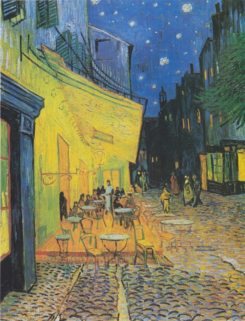
.jpg)
- Its position-relation to the theme: This painting is a key signature of Van Gogh and his use of colors. He uses strong contrast (dark in the background, lighter in the foreground) and complementary colors as well (Blue sky and yellow café) which creates a sense of perspective, line, depth and composition quite unique.
- Short description: The painting is a picturesque work. It gives off the impression of walking down a street in the South of France at night, while passing by cafes and people lounging. The Cafe is real, it is situated in Arles. When creating this piece, Van Gogh famously said, “The night is more alive and more richly colored than the day”.
- Location and European dimension: In this painting, van Gogh used for the first time his signature ‘blue and yellow swirls’ to pain a night and stary sky. To depict the night, he did not use a single touch of black, but used a wide range of his colors instead.
It is now displayed in the Kröller-Müller Museum in the Netherlands
- Possible educational exploitation: You can explore how light was created using warmer tones, all the while creating depth with darker and more intense colors. You can also use this time to explore the sky and introduce the painting to a more famous one; The Starry Night.
Artwork #10 The Old Guitarist, Pablo Picasso, 1903
This artwork is under a copyright and therefore cannot be used in this dossier. The original artwork can be seen in the Art Institute of Chicago in Chicago, USA.
- Its position-relation to the theme: This painting is a good representation of a monochromatic painting (a technique where images are composed of one color or value), with a unique lighter tone. His painting seemed to reflect his experience of relative poverty and instability, depicting beggars, street urchins, the old and frail and the blind. This monochromatic technique creates a very flat, 2D style to the painting. It gives off a sense of melancholy, sadness, and tragedy.
- Short description: The painting represents an old man, in the streets of Barcelona, Spain, in rugged clothing and poor demeanor. He seems in between life and death. The guitar, the central focus of the painting due to its brighter tone, comes to represent the guitarist’s world and only hope for survival.
- Location and European dimension: Picasso’s blue period is some of his most famous work. It is also a perfect representation of the meaning of colors. Indeed, Picasso, after learning of the death of a close friend, entered a phase of depression, which lead to his blue period. As mentioned in this dossier, blue is often a color associated with sadness.
The painting is now displayed in the Art Institute of Chicago, USA.
- Possible educational exploitation: Picasso had many period and different phase in his career. Use this painting to explore his blue period, and compare it with another one (pink, cubism, etc.) Try to find common themes across both styles and explore the differences!
Practical activities
Activity 1
Name of the activity
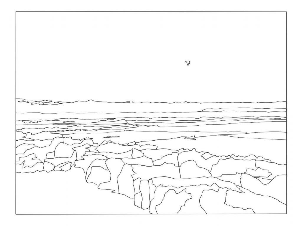
Draw me an ocean
Aims
To understand the role of colors in creating depth by using colors.
Materials
- Paint brushes
- Choice of paints (acrylics, watercolors, oils, etc.)
- A palette
If painting materials are unavailable, learners can use colored pencils as well.
- A printed copy of this landscape:
Gallery & Templates • Concepts App • Infinite, Flexible sketching
Preparatory stage for educators/mediators
Explain to your students the content of this pedagogical dossiers, and how colors can be used to create depth.
Introduce them to the role of warm and cool colors, as well as the specific tones they can use.
Remind them that color perspective states that warmest hues of yellows and greens fade into the blue atmosphere in the distance.
Development
Start by telling your learners that they will have to create depth and atmospheric perspective using colors. Do not show them the image of the landscape and the sunset right away.
Start by working on a palette. You can either give them a few colors to choose from (blue, yellow, red) to create their own tones of colors using primary colors, or you can already prepare a more complete color palette with them. This will depend on their levels and skills.
Then, introduce the different types of shading that can take place. Using darker colors for the rock in front, and lighter, blurrier colors for the background. Again, do that depending on your learner’s level.
Then, ask them to color the landscape using warm colors at the nearest edge, and cool colors near the horizontal line.
Handouts or practical sheets
You will find the landscape template here.
Activity 2
Name of the activity
Treasure hunt
Aims
Helping students to search and look for painting by using their knowledge of color theory.
Materials:
- Access to the Internet
- A computer, smartphone, or tablet
- The Team of Art Gallery
- A projector
Preparatory stage for educators/mediators
This exercise is meant to develop the learner’s critical thinking skills regarding colors, and depth. Educators should prepare themselves for various opinions, and to lead a discussion. There is no physical preparation.
Development
Pick a series of painting from the Gallery that have strong colors, and feelings of depth. Depending on your classroom’s size, you can choose between 8 and 10.
Project them to the board if you can or ask the learners to access them on their own computer. Split your classroom into groups of 2 or 3, to allow for collaboration.
Then ask them to identify some component of these painting:
- Can you identify the techniques used to create optical illusions of depth and light?
- Which paintings have the most subtle adjustments between shades?
- Which paintings have a higher contrast?
- How do you describe the effect each image has on your eye?
Then, open the discussion to the whole group. Which learners had similar answers? Were the answers unanimous inside the group? Who had diverging opinions?
After the conversation is over, open the exercise to outside galleries as well. You can find links to different resources on the Team of Art website.
Ask your learners, still in groups, to find different images:
- A high contrast painting.
- A low contrast painting.
- An image of a painting with colors of highly contrasting values.
- An image of a painting with colors of similar value.
- A painting in which the level of value contrast affects the mood of the image.
- A painting in which the value contrast creates texture.
- A painting in which the value contrast emphasizes the focus of the image.
- …
Lastly, depending on your learner’s level, you can create an analytical workshop. Using art analysis questions such as the ones here: ‘Analysis Artwork’, pick one or two paintings with high significance and meaning to analyse the artwork.
Handouts or practical sheets
Refer to the Practical Sheets based on:
- Elements of art analysis
- How to look for art outside of museums and cultural centers?
- Appreciating and understanding the value of art
- How to use Europeana?